Welcome

Welcome!
Thanks for visiting this blog. Please share information about this blog among your friends interested in ISO 9001:2015 QMS Awareness.
- Keshav Ram Singhal
krsinghal@rediffmail.com
keshavsinghalajmer@gmail.com
Blog on 'Quality Concepts and ISO 9001: 2008 Awareness' at http://iso9001-2008awareness.blogspot.in

Academic comments are invited. Please join this site. Reproduction of articles from this blog is encouraged, provided prior information is provided. Please give credit to the blog and the writer, and also send a copy of the published material to the editor of the blog.

Various information, quotes, data, figures used in this blog are the result of collection from various sources, such as newspapers, books, magazines, websites, authors, speakers, information from google search, ChatGPT (a large language model trained by OpenAI), Gemini Google, Bing Copilot and other AI tools etc. Unfortunately, sources are not always noted. The editor of this blog thanks all such sources.

Encouragement Support - Please become a member of NCQM - National Centre for Quality Management

People from following (more than 90) countries/economies have visited this blog: Albania, Algeria, Argentina, Australia, Austria, Azerbaijan, Bahamas, Bahrain, Bangladesh, Belgium, Bosnia and Herzegovina, Brazil, Bulgaria, Burundi, Cambodia, Canada, Chile, China, Colombia, Croatia, Denmark, Ecuador, Egypt, Estonia, Ethiopia, European Union, Finland, France, Georgia, Germany, Gibraltar, Greece, Hong Kong, Iceland, India, Indonesia, Ireland, Israel, Italy, Japan, Kenya, Luxembourg, Lebenon, Macedonia, Malawi, Malaysia, Malta, Mauritius, Mexico, Moldova, Monaco, Morocco, Myanmar, Namibia, Nepal, Netherlands, Nigeria, Oman, Pakistan, Peru, Philippines, Poland, Portugal, Qatar, Romania, Russia, Saudi Arabia, Serbia, Seychelles, Singapore, Slovakia, Slovenia, South Africa, South Korea, Spain, Sri Lanka, Sudan, Sweden, Taiwan, Tanzania, Thailand, Trinidad and Tobago, Tunisia, Turkey, Uganda, Ukraine, United Kingdom, United Arab Emirates, United States, Venezuela, Vietnam, Yemen, Zimbabwe.

Thursday, July 6, 2017

Understanding Statistical Tools and Techniques - 11 - PROCESS MAPPING


PROCESS MAPPING

Process mapping is a workflow diagram that brings forth a clear understanding of a process or a number of processes. A process map is a planning and management tool that visually describes the flow of work. Process map shows a series of events that produce an end result. A process map is also known as a flowchart, process flowchart, process chart, functional flowchart, functional process chart, process model, workflow diagram, business flow diagram or process flow diagram.

The purpose of process mapping is to gain better understanding of a process and to improve efficiency. It provides insight into a process. It helps the involved people to know the process steps and brainstorm ideas for process improvement. It is a documented information that increase communication.

Process mapping involves following steps:

Step 1 - Select the process for which process mapping is to construct and determine boundaries of the process - where to start (beginning of the process) and where to end (process end).

Step 2 - List all steps involved in the process with sufficient information.

Step 3 - Sequence all steps from start to end.

Step 4 - Draw process map by using appropriate symbols.

Step 5 - Check the flowchart for completeness and include pertinent information.

Step 6 - Finalize the flowchart.

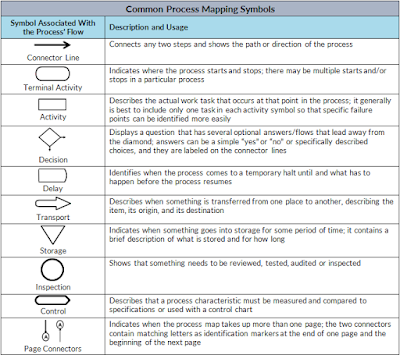
Common process mapping symbols are described in the below figure:


How you liked the write-up. Please post your comments. Thanks.

- Keshav Ram Singhal


Wednesday, July 5, 2017

Understanding Statistical Tools and Techniques - 10 - STRATIFICATION


STRATIFICATION

Stratification is a statistical tool used in combination with other analysis tool. When data from a variety of sources or categories lump together, it is difficult to visualize the meaning of data. Stratification technique separates the data so that pattern of the data can be seen.

Stratification is a technique used to analyze or divide a universe of data into homogeneous groups (strata) often data collected about a problem or event represents multiple sources that need to be treated separately. It involves looking at process data, splitting it into distinct layers (almost like a rock is stratified) and doing analysis to possibly see a process improvement. Stratification is related to segmentation, but it is different from segmentation.


Following procedure will be useful:

- Before collecting data, consider the information and sources of data that can have effect on the results. Plan to collect stratification information.
- After collecting data, when you plot or graph the collected data on scatter diagram or control chart or histogram or any other analysis tool, use different marks or colours to differentiate data from various sources.
- Data plotted or graphed that differentiate from each other are said to be stratified.
- Analyze subsets of stratified data separately.


Some examples of different sources that may require data to be stratified are different equipment, shifts, departments, materials, suppliers, products, days or time.

Thus, analysis of survey data can be benefited from stratification technique.

How you liked the write-up. Please post your comments. Thanks.

- Keshav Ram Singhal


Monday, July 3, 2017

Understanding Statistical Tools and Techniques - 09 - SCATTER DIAGRAM


SCATTER DIAGRAM

A scatter diagram is a graphical representation of two variables showing the relationship between them. If variables are correlated, the points will fall along a line or a curve. This diagram is also known as a scatter plot, x-y graph, or correlation chart. It is a problem solving tool.

We can use scatter diagram when we may have paired numerical data and one variable data is dependent on other variable. Scatter diagram can be constructed by plotting two variables against one another on a pair of axes. With the help of scatter diagram, we can try to determine whether two variables are related and potential root causes of problems.


It will be useful to draw scatter diagram after brainstorming causes and effects using a cause and effect diagram to determine whether a particular cause and effect are related. A scatter diagram is used to uncover possible cause-and-effect relationship.

Following procedure will be useful to construct a scatter diagram:
- Decide two variables against which you wish to see the relationship
- Collect pairs of data of these two variables
- Draw a graph with independent variable on the horizontal axis and the dependent variable on the vertical axis
- For each pair of data, put a dot or symbol where x-axis value intersect y-axis value
- Look at the pattern of dots (or symbols) to see if a relationship is obvious
- If data form a line or a curve, it indicates that variables are correlated


When data forms a line or curve, then you may use regression analysis or correlation analysis by using following steps:
- Decide the points from top to bottom by drawing horizontal line
- Divide the points from left to right by drawing a vertical line
- If number of points is odd, you should draw the line through the middle point
- In this way, you will be able to divide points on the graph into four quadrants
- Count the points in each quadrant (leaving the point on the line)
- Add diagonally opposite quadrants
- Find smaller sum and total of points in all quadrants
- A = points in upper left + points in lower right
- B = points in upper right + points in lower left
- Q = the smaller of A and B
- N = A + B
- Look up the limit for N on the trend test table


- If Q is less than the limit, two variables are related
- If q is greater than or equal to the limit, the pattern could have occurred from random chance and we can say that no relationship is demonstrated

How you liked the write-up. Please post your comments. Thanks.

- Keshav Ram Singhal